RENDER COLOUR CHARTS
6 products
Showing 1 - 6 of 6 products
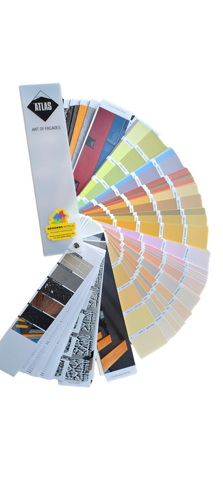
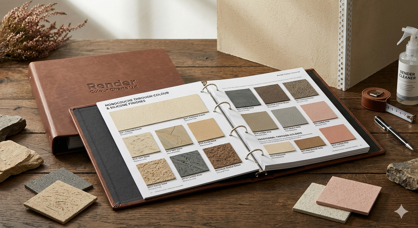
Choosing the right colour for a rendered facade is one of the most visible decisions on any building project, and a physical colour chart is the only way to see exactly how a shade will look on the wall before the first tub is opened. This collection within the rendering materials range brings together factory-applied sample books and colour catalogues for the Atlas and Ceresit render systems — spanning more than 1,000 intermixable shades across silicone, acrylic, silicone-silicate, and mosaic render finishes. Every swatch reproduces the actual pigmented render at its specified grain thickness, so the colour you hold in your hand matches the colour your installer will trowel onto the facade.
When Render Colour Charts Save Time on UK Projects
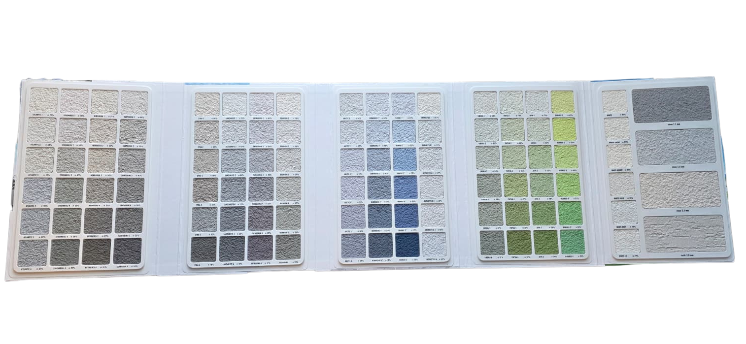
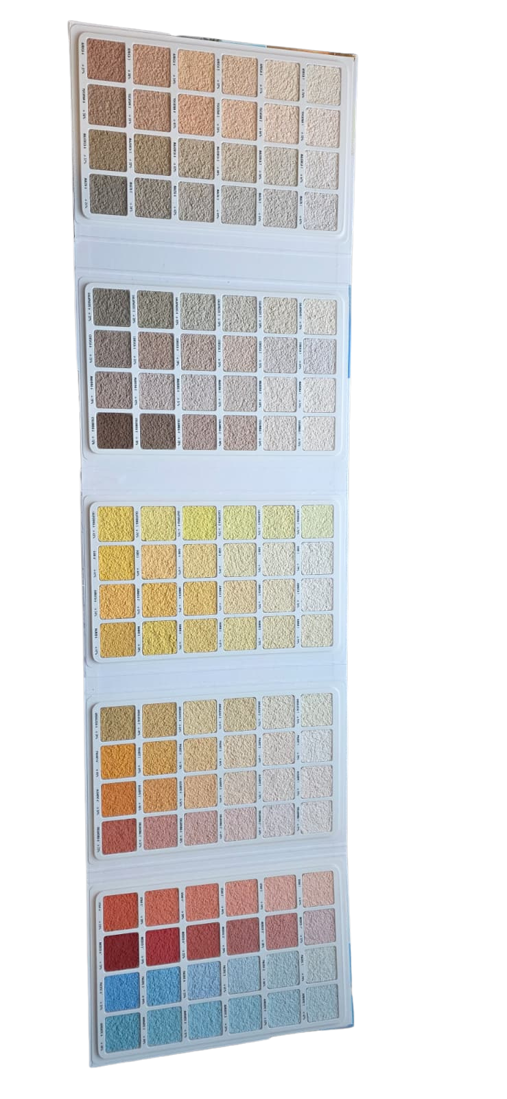
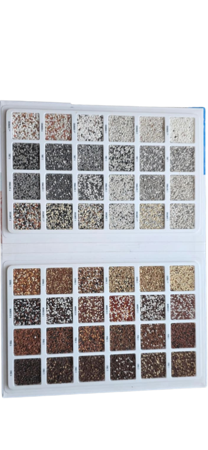
Render colour charts are factory-tinted physical sample books and printed catalogues showing the full Atlas 480-shade SAH palette and the Ceresit Colours of Nature system across more than 1,000 intermixable shades — every swatch produced from real render at the specified grain size, EN 15824:2017 verified, and matched directly to a tub-label code that travels from sample table to scaffold without translation. They earn their place at the start of every UK facade project where colour accuracy matters more than the cost of a small sample order.
Physical colour samples deliver accuracy that no screen or printed brochure can replicate, because digital displays shift hue under different ambient lighting and ink on paper cannot show how real render texture reflects natural daylight. The same pigment looks meaningfully different at 1.5 mm grain compared to 2.0 mm because deeper aggregate casts more shadow, and a north-facing elevation at 4 pm in winter reads cooler than the same wall at midday in July. Holding a sample against your actual brickwork under morning and afternoon light is the most reliable way to confirm a choice you will be living with for decades.
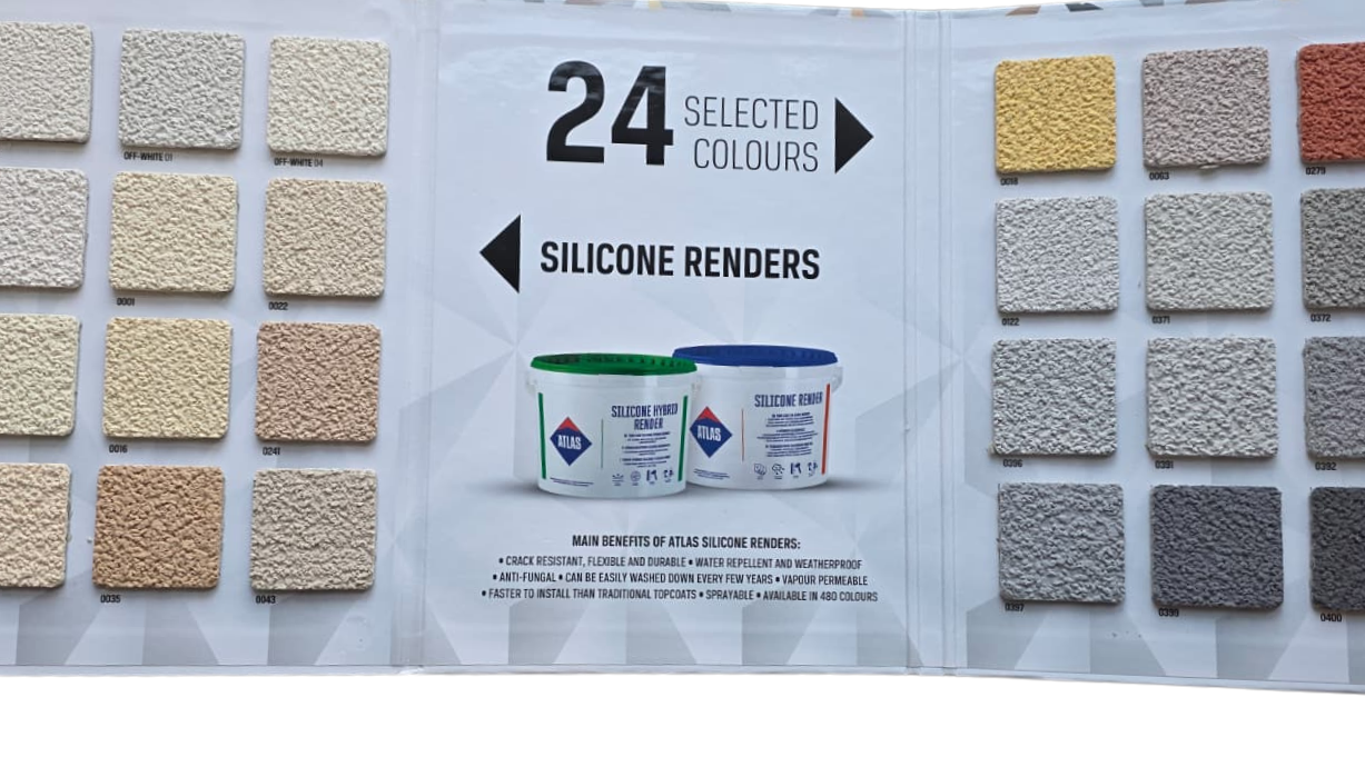
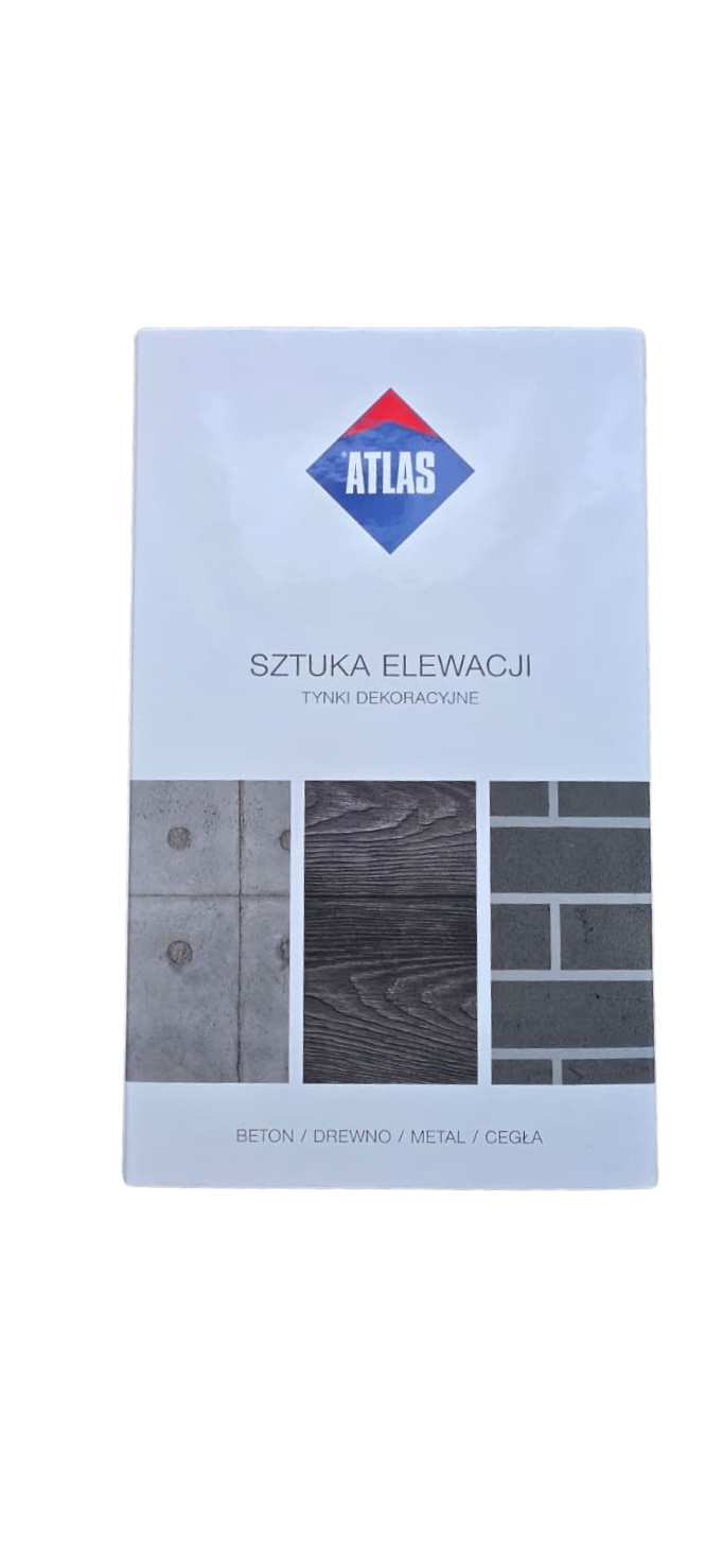
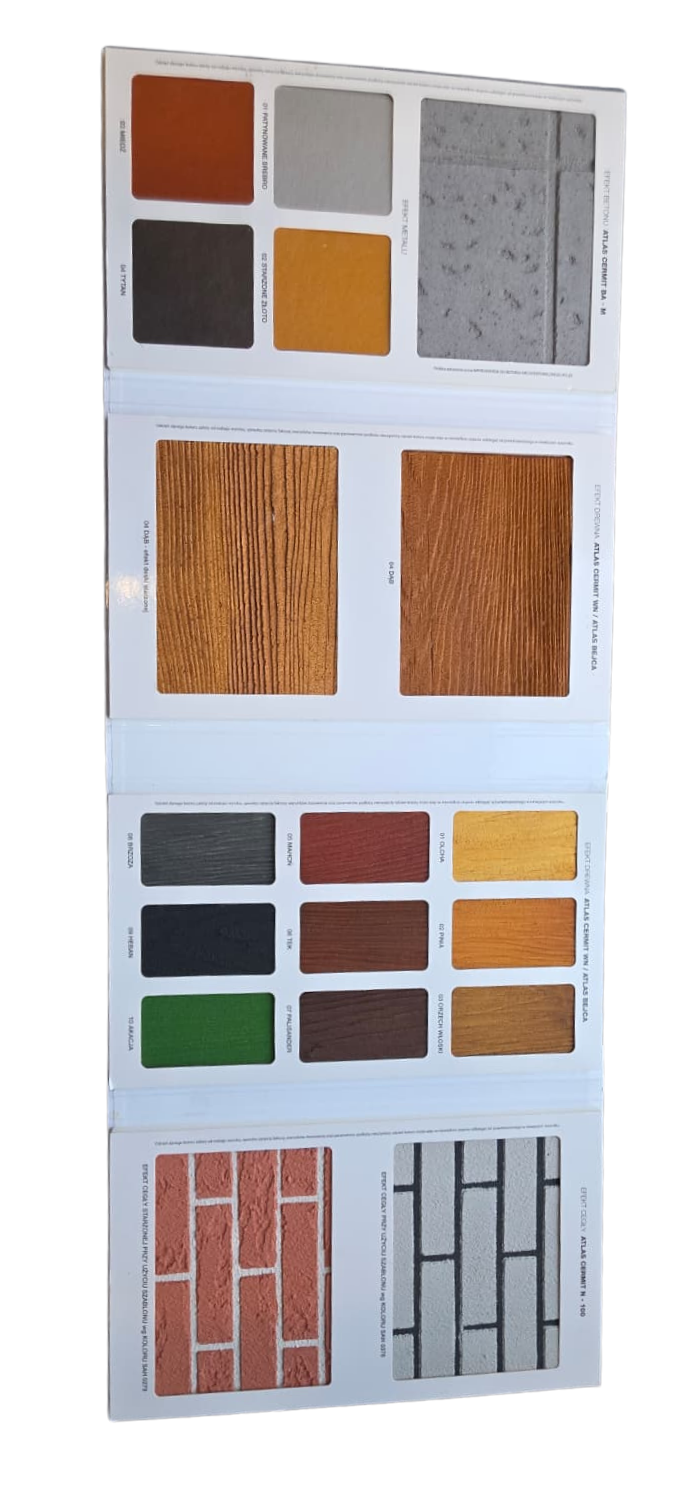
The collection covers every common project scenario: domestic facade refreshes where a 24-shade Atlas shortlist is the practical starting point, multi-unit new-build developments needing the full 480-colour catalogue for tender documentation, decorative plinth finishes calling for the dedicated Ceresit mosaic sample, and stamped concrete or brick-effect surfaces where the Atlas Concrete and Brick sample shows real texture-and-tint combinations. Whether the reader is a homeowner narrowing a shortlist, an installer confirming a tone on site, or a developer locking documented codes at specification stage, the right sample book sits between hesitation and order.
Why Specifiers Order Render Colour Charts Up Front
- Confident colour decisions before the first tub opens. Each swatch displays the actual through-coloured render at its specified grain size, so the finish approved on the sample is the finish that appears on the wall — through-colouring means pigment runs through the entire render layer, keeping the facade looking consistent even after minor surface wear over decades.
- Over 1,000 shades across two certified systems. The Atlas 480-colour catalogue and two Ceresit sample books together span warm earth tones, contemporary greys, bold anthracites, and heritage pastels — every shade belongs to a BBA-certified, EN 15824-compliant render system independently proven to resist fading for 25 years or more.
- Texture-accurate previews at the chosen grain. Colour appearance shifts with aggregate depth — a 1.5 mm grain casts different micro-shadows from a 2.0 mm grain, which can make the same pigment look noticeably darker. Physical samples let you verify the interaction between colour and texture at the exact grain you intend to specify, so there are no surprises once the scaffolding is up.
- Project-specific sample sets that match the product. Dedicated sets exist for silicone render finishes, mosaic plinth renders, and concrete-and-brick decorative effects, allowing the correct sample type to be matched to the planned product and eliminating confusion from cross-referencing unrelated colour codes.
- Cost and waste prevention on every project. Ordering a sample book before purchasing full-size tubs prevents costly re-orders and batch mismatches — a single low-cost sample investment protects the entire material budget, particularly on large elevations where a mid-project colour change is impractical once the first coat has been applied.
- Professional specification tool with full traceability. Architects, developers, and main contractors use these catalogues to lock in colour specifications at tender stage, ensuring the approved shade is documented and traceable from design through to handover — a standard requirement on professional projects and a confidence-builder for homeowners working with an installer.
Selection Guide — Find Your Colour Sample in 30 Seconds
Identify the render system you plan to specify and the depth of colour exploration the project needs — read across the row to confirm the shade count and use case, then follow the system link to order the matching sample for next-day UK delivery.
| Your Project | Best Sample | Render System | Shade Count |
|---|---|---|---|
| Full-palette specification — architects and developers, tender records | Atlas Catalogue 480 Colours | Atlas Silicone, Acrylic, Silicone-Silicate | 480 shades |
| Quick shortlist for a domestic facade renovation | Atlas Render Sample 24 Colours | Atlas Silicone Render | 24 popular shades |
| Ceresit system specification — standard residential and commercial shades | Ceresit Colour Sample Book 1 | Ceresit CT 74 / CT 174 / CT 76 | Full Vol. 1 palette |
| Extended Ceresit shades — earth-tone trends and contemporary palette | Ceresit Colour Sample Book 2 | Ceresit CT 74 / CT 174 / CT 76 | Full Vol. 2 palette |
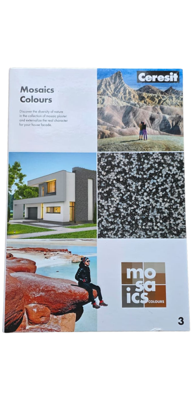
| Plinth, column, or entrance feature finish | Ceresit Mosaic Sample | Ceresit CT 177 Mosaic | 48 mosaic blends |
| Decorative stamped concrete or brick-effect surface | Concrete and Brick Sample | Atlas Concrete and Brick Effect | Texture and tint set |
How to Use Render Colour Charts Effectively on UK Projects
Every colour shown in these sample books is available as a factory-tinted, through-coloured render — pigment runs through the full thickness of the finish rather than sitting on the surface, so minor scuffs or surface wear are far less likely to reveal a different base colour underneath. The shade selected from a sample book translates directly into the finished product without site tinting or colour-matching by the installer, so the comparison below shows exactly how each system code travels from sample table to scaffold.
Both the Atlas SAH palette and the Ceresit Colours of Nature system use numeric codes that appear identically on the tub label at delivery, providing specification continuity from sample to site even on multi-phase projects where materials arrive months apart. For colour exploration on the wider RENDER-COLOUR pillar — including light-reflectance value, exposure orientation, and palette coordination across multi-elevation buildings — the choosing silicone render colours guide is the dedicated decision pillar, and it is the link to follow when the colour question genuinely needs depth before the sample arrives.
- Step 1 — Order the sample matched to the render system. Atlas SAH catalogue for Atlas thin-coat renders; Ceresit Sample Book 1 or 2 for CT 74, CT 174, and CT 76 systems; the dedicated mosaic or concrete-and-brick sample for those product families.
- Step 2 — Order at the planned grain size. For mid-tone and dark shades especially, request the sample at the 1.5 mm or 2.0 mm grain that will go on the wall — the perceived darkness shift between grain sizes is most pronounced on these tones.
- Step 3 — Hold against the actual substrate at eye level. Place the swatch flat against the brickwork or render under both morning and late-afternoon natural light; UK daylight shifts significantly between seasons and compass orientations, and a south-facing wall reads warmer at midday than the same shade on the north elevation at 4 pm.
- Step 4 — Compare materials together for colour-drenched schemes. Where the project pairs render with anthracite oversills, dark rainwater goods, or matched cladding, request the powder-coat or cladding sample alongside the render swatch and compare under identical conditions before specification freezes.
- Step 5 — Document the code at tender stage. Lock the SAH or Ceresit numeric reference in the project specification so the colour travels traceably from sample table through to handover inspection — this is standard practice on developer and main-contractor schemes.
For projects exploring contemporary palettes, the earth-tones and colour-drenching trends guide covers the warm-tone direction shaping UK facade design through 2026 and how the Ceresit Sample Book 2 extended palette supports the look. The render grain size comparison guide quantifies the visual and material differences between 1.0 mm, 1.5 mm, and 2.0 mm options. For dark-colour specifications on insulated south-facing elevations, the solar heat risk guide sets out the HBW thresholds and confirms when CT 76 Solar Protect is the safer formulation.
Practical Tips From UK Renderers Using Colour Samples
Experienced installers consistently report that a handful of habits separate a confidently chosen colour from a regret-after-handover specification — and these are the practical observations that pay for the sample order several times over on a single project.
- Assess on site, never in showrooms. Holding the sample flat against the actual substrate at eye level during both morning and late-afternoon light gives the truest colour read; a shade that appears warm under midday sun can look noticeably cooler on a north-facing elevation at 4 pm in winter.
- Order two copies of shortlisted samples on multi-elevation projects. One copy stays permanently on site for ongoing comparison during installation, while the other travels to client sign-off meetings — this avoids the common loss of the only reference swatch mid-project.
- Match the grain size on the sample to the spec. For mid-tone and dark shades, the 0.5 mm difference between 1.5 mm and 2.0 mm grain genuinely shifts the perceived colour; ordering the sample at the wrong grain is one of the most common sources of post-installation surprise.
- Keep one sample with the original tub batch. When the first delivery arrives, store one swatch with the batch number recorded on the back; it becomes the definitive reference for subsequent re-orders and confirms colour continuity if the project runs across multiple Atlas or Ceresit production batches.
- Pair render and oversill samples together for drenched schemes. For colour-drenching where render, sills, and rainwater goods sit in the same tonal family, request a powder-coat swatch alongside the render sample and compare under identical conditions — the eye reads even small mismatches once both sit side by side on the finished facade.
Is a Render Colour Sample Right for Your Project?
- Choose a domestic shortlist sample when you are renovating your own home and want the most popular, proven shades to test against your brickwork in natural daylight at different times of day — the Atlas 24 Colours sample or Ceresit Sample Book 1 give the confidence you need to finalise the choice without paging through hundreds of niche shades.
- Choose a full catalogue when the project is a development, commercial scheme, or specification needing documented colour codes for client sign-off, tender records, and Building Control submissions — the Atlas 480-Colour Catalogue or both Ceresit sample volumes are permanent reference tools for the office or site.
- For plinth zones, the Ceresit Mosaic Sample is the correct starting point and pairs naturally with the wider mosaic renders collection — both swatches placed together on site under natural daylight confirm the plinth and main-wall tones complement each other before any material is ordered.
- For decorative concrete or brick effects, the Atlas Concrete and Brick Sample shows the available textures and tint options across the wider concrete effect render range, giving a second creative direction to explore alongside standard thin-coat colour selection.
- If colour selection is already settled, head straight to the premium silicone render collection to find the matching SAH or Ceresit code and order full-size tubs — the sample step is only essential when the colour decision is still open or documentation is required for the project record.
FAQ — Render Colour Charts, Ordering, and Specification
How much do render colour sample books cost, and is ordering one worth it?
Sample books in this collection are a small, low-cost investment compared to the price of full-size render tubs — and they pay for themselves the moment they prevent a single wrong-colour order. A 25 kg tub of silicone render costs significantly more than any sample catalogue, so confirming a shade on a physical swatch before committing to a bulk order protects the entire material budget. For developers managing multi-unit schemes, the saving is even more pronounced: documenting an approved colour code at tender stage avoids costly elevation re-renders if a shade is rejected at handover inspection. Approximate per-sample pricing is shown on each product page subject to current pricing.
How do I choose between 1.5 mm and 2.0 mm grain when selecting a colour?
Grain size affects how light interacts with the render surface — a 2.0 mm grain casts deeper micro-shadows that may darken the perceived colour slightly compared to a smoother 1.5 mm finish. Ordering the sample at the grain size you plan to use on site eliminates this uncertainty entirely. The render grain size comparison guide linked in the application section above explains the visual, coverage, and workability differences in full detail, with practical recommendations for matching grain to facade texture.
Are dark colours safe to use on an insulated facade?
Bold dark shades — anthracite, charcoal, and deep earth tones — are safe to use on insulated facades when paired with a solar-reflective render formulation. Products such as Ceresit CT 76 Solar Protect use infrared-reflective pigments that keep the surface noticeably cooler than a standard finish in the same shade, so dark colours perform reliably on south-facing and west-facing elevations over standard EWI board types. Checking the Heat Brightness Value of the chosen shade — a scale where 0 is black and 100 is white, confirmed by the supplier — ensures the colour is compatible with the intended elevation orientation.
Are physical colour samples wasteful, or can they be recycled?
Each sample book contains a very small volume of applied render — far less material than a single tub — so the environmental footprint of ordering a catalogue is minimal. More importantly, the sample prevents a far larger waste scenario: ordering full tubs of the wrong shade generates significantly more material waste and transport emissions than confirming the colour on a physical swatch first. Sample books are reusable across multiple projects, and many installers keep a single set as a standing reference for years.
Which sample should I order if I only want to render a plinth area?
For plinth zones, the Ceresit Mosaic Sample Book is the correct starting point — it contains real texture and colour blends from the CT 177 mosaic render range, formulated for high-impact splash zones at the base of a building where durability and water resistance matter most. For a decorative concrete or brick effect on the plinth instead, the Atlas Concrete and Brick Sample shows the available textures and tint options for that range, giving a second creative direction to explore.
Can I match a render colour to a RAL or NCS reference instead of using a sample book?
Bespoke colours matched to RAL, NCS, or another manufacturer's reference are blended on the dedicated Atlas and Ceresit mixing equipment at our Southampton warehouse, so projects with locked exterior colour palettes can specify outside the standard SAH or Colours of Nature systems where the design demands it. A physical sample book remains useful even for bespoke work — it shows the closest match within the standard palette as a baseline, which often leads to a faster and more cost-effective decision than full custom tinting on a tight programme.