
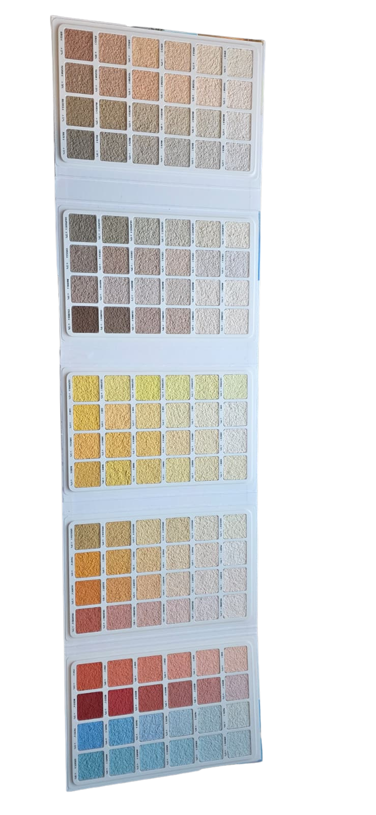


Description
Ceresit Colour Sample Book 2 sits in the render colour charts and catalogues collection at Renders World as the extended-range companion to Book 1, covering the mood-based and contemporary palette groups within the Ceresit Colours of Nature system. Where Book 1 organises shades by landscape and geography, Book 2 groups them by aesthetic personality — confident greys, romantic pastels, energetic accents, and intense statement tones — making it the natural reference for design-led UK facade specifications.
When Ceresit Colour Sample Book 2 Saves Time on UK Projects
For UK projects where the facade brief begins with a mood or design direction rather than a specific colour name, Ceresit Colour Sample Book 2 is the bound physical reference that turns "modern but not cold" or "confident grey, not corporate" into a Ceresit code in minutes. The book groups colours into seven aesthetic palettes — Wise & Confident, Grey Vibes, Harmonious & Balanced, Romantic & Delicate, Energetic & Positive, Intense & Expressive, and Mosaic — produced as real rendered swatches at full Ceresit texture and pigment fidelity.
Architects, contractors, and interior designers reach for Book 2 ahead of digital visualisers because the mood-based grouping mirrors how design conversations actually start. The Grey Vibes section in particular handles the dominant share of current UK facade specifications, with cool, neutral, and warm greys curated side by side rather than scattered across geographic families. For the foundational geographic palettes — Water, Sand, Earth, and Forest — the Ceresit Colour Sample Book 1 is the companion reference, and pairing both books provides the complete 516-shade Colours of Nature library in physical form.
Why Specifiers Order Ceresit Colour Sample Book 2 Up Front
- Mood-based palettes that match how clients talk: Groupings by personality — confident greys, romantic pastels, energetic accents — let homeowners and architects shortlist from a brief rather than from abstract colour codes.
- Grey Vibes for the UK's dominant facade trend: Every viable grey from silver mist through mid-stone to deep charcoal sits on consecutive pages, removing the cross-referencing usually needed to compare cool, neutral, and warm greys.
- Contemporary and saturated tones beyond Book 1: Intense & Expressive and Energetic & Positive deliver bolder facade statements that the traditional geographic palettes do not cover, ideal for commercial, hospitality, and signature residential projects.
- Pre-coordinated multi-tone schemes: Harmonious & Balanced is curated specifically for colour-drenching and multi-plane facades, providing matched palettes that architects can present as coordinated schemes rather than individual picks.
- Tactile Mosaic reference for plinth and feature detailing: The dedicated Mosaic section shows real aggregate-blended colours for textured plinth and feature renders — accuracy that printed catalogues cannot replicate.
- Five Ceresit render systems, one reference: Codes apply across silicone, silicate-silicone, acrylic, silicate, and elastomeric plasters plus matching facade paints, covering several product decisions in one book.
Selection Guide — Find Your Ceresit Colour Reference
| Your Situation | Right Reference | Why |
|---|---|---|
| Contemporary, grey, or design-led Ceresit specification | Ceresit Colour Sample Book 2 (this product) | Grey Vibes · Wise & Confident · Intense & Expressive · Mosaic palettes |
| Traditional palette — Water, Sand, Earth, or Forest | Ceresit Colour Sample Book 1 | Core geographic families · six gradations per name |
| Full Ceresit colour library required | Book 1 + Book 2 together | Complete 516-shade Colours of Nature system in physical form |
| Project uses Atlas renders instead of Ceresit | Atlas Render Sample — 24 Colours | Correct palette for Atlas SAH system |
Technical Specifications — Ceresit Colour Sample Book 2 Data
| Property | Detail |
|---|---|
| Sample type | Bound physical colour guide with real rendered swatches |
| Colour system | Ceresit Colours of Nature — extended palettes |
| Palette groups | Wise & Confident, Grey Vibes, Harmonious & Balanced, Romantic & Delicate, Energetic & Positive, Intense & Expressive, Mosaic |
| Total system colours (Books 1 + 2) | 516 |
| Render types represented | Silicone, silicate-silicone, acrylic, silicate, elastomeric |
| Paint types represented | Acrylic, silicone, silicate, elastomeric facade paints |
| Solar-exposure notation | Colour type indicator per swatch; restricted shades flagged for sun-exposure guidance |
| Format | Bound sample book |
| Intended users | Architects, specifiers, contractors, interior designers, homeowners |
| Recommended assessment | Natural daylight at the project site for most accurate comparison |
How to Use Ceresit Colour Sample Book 2 Effectively
The book delivers most value when colours are assessed under the conditions the facade will actually face. Indoor showroom or office lighting shifts the subtle mid-tone differences within Grey Vibes and Harmonious & Balanced — the very nuances that separate a warm mid-grey from a cool one. Take the book outdoors at the project site, hold it flat against the wall at chest height, and step back two to three metres to see how the shortlisted shade reads from the street.
Check shortlisted colours at two different times of day, because the mid-tones and muted shades in Book 2 shift more noticeably between morning and afternoon light than the lighter pastels in Book 1. For multi-colour schemes — main facade, returns, feature panel — place all chosen swatches on the wall together to confirm the palette reads as intended under the same lighting.
When the shortlist includes shades from Intense & Expressive or saturated greys from the deeper end of Grey Vibes, cross-check the colour-type notation before confirming the order. Saturated colours on south- or west-facing elevations absorb significantly more solar radiation, and the guide to dark colours and solar heat risk on render explains how to read the notation system and when to specify a heat-reflective product. For wider methodology, the silicone render colour selection guide covers how grain size, surface texture, and adjacent materials shape the final appearance, and the earth-tones and colour-drenching trends guide shows how the Harmonious & Balanced and Intense & Expressive palettes are being applied on current UK projects.
Practical Tips From UK Renderers
- Bring Book 2 alongside Book 1 to first consultations. Mood-based groupings shortcut the conversation when clients describe a feeling rather than a colour name — a homeowner saying "modern but warm" goes straight to Harmonious & Balanced.
- Open Grey Vibes first on contemporary projects. It dominates current UK specifications, and having every viable grey on consecutive pages saves the longest decision on most jobs.
- Cross-check solar notation for any shade darker than mid-tone. Intense & Expressive and the deeper end of Grey Vibes need careful elevation assignment — flagging this at quotation stage avoids a colour-change request mid-project.
- Photograph the chosen swatch page with the Ceresit code visible. Sending it to the client as written confirmation before ordering becomes the definitive reference at final inspection.
- Pair Harmonious & Balanced selections within their own palette. The groupings are pre-coordinated for multi-plane facades, so mixing across palettes usually weakens the scheme rather than strengthens it.
Is Ceresit Colour Sample Book 2 Right for Your Project?
- Ideal for your project if you are specifying a Ceresit facade render or paint and the design brief centres on contemporary tones — greys, colour-drenching schemes, bold accents, or Mosaic decorative finishes that sit beyond the traditional geographic palettes.
- Need the foundational geographic palettes instead? The Ceresit Colour Sample Book 1 is the correct reference for the Water, Sand, Earth, and Forest families with six gradations per geographic name — the right starting point for traditional or conservation-appropriate specifications.
- Specifying a dark shade on a sun-exposed elevation? The Ceresit CT76 Solar Protect render is formulated for darker colours on south-facing walls, managing the additional thermal load that saturated shades create.
- Working with Atlas renders rather than Ceresit? The Atlas Render Sample — 24 Colours covers the Atlas SAH system for silicone, acrylic-silicone, and silicate-silicone finishes.
- Want to see live finish options? Browse the premium silicone render range for the products the Ceresit colour codes apply to.
FAQ — Ceresit Colour Sample Book 2 Ordering, Use, and Practical Notes
How much does Ceresit Colour Sample Book 2 cost, and should I order both books?
The book is a low-cost specification tool that prevents the far greater expense of committing to a full facade colour that looks different on the wall than anticipated. For projects with a defined traditional palette requirement, Book 1 alone may suffice. For contemporary, design-led, or grey-led schemes, Book 2 is essential, and ordering both books together provides the complete 516-shade Colours of Nature library in physical form. Current pricing is displayed on the Renders World product page, and the combined cost of both books typically represents a fraction of a single bucket of render.
Are the colours in Book 2 compatible with environmentally friendly render options?
The Ceresit silicone render range represented in the book is water-based and low-VOC, with hydrophobic and self-cleaning properties that reduce chemical cleaning over the building's lifetime. Lighter shades from Grey Vibes and Harmonious & Balanced reflect more solar radiation than deeper tones, lowering thermal gain on the facade — a meaningful consideration under current UK energy performance targets. Silicone renders also resist algae and mould naturally, keeping the facade cleaner for longer without biocide treatments. For darker Intense & Expressive shades, pairing the render with an elastic basecoat manages higher thermal stress without compromising the environmental credentials of the specification.
What is the difference between the palette groups in Book 2 and the geographic families in Book 1?
Book 1 organises colours by landscape — Water for cool blues and greys, Sand for warm neutrals, Earth for terracottas and browns, Forest for greens and olives — with six tonal gradations per geographic name. Book 2 organises by aesthetic mood: Wise & Confident delivers authoritative tones; Grey Vibes curates the full spectrum of greys in one place; Harmonious & Balanced offers pre-coordinated multi-tone palettes; Romantic & Delicate provides soft pastels; Energetic & Positive introduces vibrant accents; Intense & Expressive covers deeply saturated statement colours; and Mosaic shows the decorative aggregate-blended palette. The two books are complementary — geography-based for proven selections, mood-based for design-led choices.
Can I use Book 2 swatches for a conservation area planning application?
Physical swatches are the most effective way to demonstrate a proposed colour to a planning officer, because they show the actual rendered finish rather than a printed or digital approximation. Conservation areas often favour more traditional, restrained tones — many of which sit in the core geographic palettes — but the Wise & Confident and Harmonious & Balanced groups in Book 2 include muted, heritage-appropriate shades that can satisfy conservation requirements, subject to current planning guidance for the specific site. Submitting the chosen swatch page with its Ceresit colour code alongside the planning application provides an unambiguous record.
Do the deeper colours in Intense & Expressive need special application considerations?
Deeply saturated colours absorb more solar radiation, which can raise facade surface temperatures on south- and west-facing elevations. Ceresit manages this through its solar-exposure notation — each swatch carries a colour-type indicator that flags whether the shade is suitable for sun-exposed orientations or best reserved for sheltered and north-facing walls. For projects where a dark or intense colour is specified on an exposed elevation, pairing the render with an elastic basecoat and using a grey tint base ensures the system accommodates higher thermal movement without compromising the finish.
How should I store the book between projects?
Storing the book flat in its original binding and away from prolonged direct sunlight keeps the swatches representative for repeated use across multiple specifications. Although applied-render finishes are more resistant to fading than printed colour charts, sustained UV exposure will gradually shift pigments on any reference material. Keeping the book in a project folder alongside notes on previously specified codes makes it straightforward to return to an approved shade for follow-on phases or maintenance render work years later.