
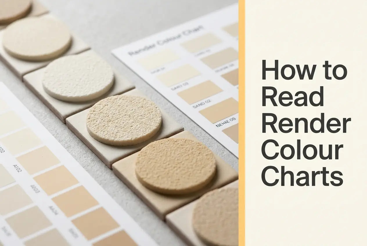
Using colour charts for render projects is a five-minute job done properly and an expensive one done indoors, because the three things that move a shade between the swatch and the wall — grain, application method and production batch — are all written into the render data sheets rather than onto the chart. The Renders World render colour charts and sample books are the physical references those sheets assume you are holding.
What follows is the method rather than the merchandise. Which reference to order, and what each one contains, belongs on the collection page; this guide covers how to read one on an elevation, what the manufacturers say will shift a colour after sign-off, and how to lock the code so it survives to handover.
Read the Swatch Against the Wall, Not Against the Kitchen Table
Using colour charts for render projects starts outdoors, because the Atlas Silicone Render sheet declares 480 colours in the SAH scheme and nothing on a screen distinguishes the near neighbours in a palette that size once real daylight is involved.
A physical swatch carries pigmented render at its actual texture, so it reflects light the way the finished coating will. The routine that settles most hesitation takes two visits to the same wall:
- Hold the swatch flat against the substrate, not at an angle and not in your hand at chest height — a render surface reads differently when light rakes across it.
- Look once in the morning and once in late afternoon, so the shade is judged in both warmer and cooler light before anything is tinted.
- Test each elevation separately where a building has strongly contrasting faces, rather than assuming one read covers the whole facade.
- Shortlist before you go outside. Comparing a handful of candidates against the brickwork is manageable; comparing a full catalogue outdoors is not.
Orientation is the reason the two visits matter, and it is also the point where this guide hands over: the silicone render colour selection guide owns light, aspect and palette coordination in depth, while this page stays with the mechanics of the chart itself.
Palettes Belong to Systems, and the Codes Do Not Cross
Each manufacturer runs its own numbering, and a code only means something inside the scheme it came from. The four sheets fetched for this guide name their palettes explicitly, which makes the matching rule simple.
| Render | Palette its sheet names | Grain versions on the sheet |
|---|---|---|
| Atlas Silicone Render | 480 colours to the SAH Paints and Plasters range, plus individual colours to customer instruction | Lambskin aggregate, N-15 up to 1.5 mm, N-20 up to 2.0 mm |
| Ceresit CT 74 Silicone Self Clean | Full palette of Ceresit Colours of Nature | 1.5 mm, 2.0 mm or 2.5 mm |
| Ceresit CT 76 Solar Protect | Colours of Nature and the extended Intense palette | 1.5 mm or 2.0 mm |
| Ceresit CT 174 Machine | Full palette of Ceresit Colours of Nature | 1.0 mm, machine application |
The Ceresit sheets say "full palette" without giving a number, while the brand's own Colours of Nature page states more than 500 colours — a figure at palette scope, not a count for any one render, and not comparable with the Atlas 480 because the two schemes are numbered differently. Where render and paint must match on one building, confirm the code against each product rather than against the scheme, since a palette shared by name is not a palette shared by contents.
Three Things That Shift a Colour After the Chart Is Signed Off
This is the part a chart cannot show you, and all three are documented rather than folklore. Each has a cheap precaution attached.
Grain changes what the eye reads
A coarser aggregate develops more surface relief, and the manufacturers treat that development as something that affects colour directly. Ask which grain a swatch was produced at and match it to the version you intend to specify — CT 74 alone runs three, at 1.5, 2.0 and 2.5 mm, and a shade approved on one is not quite the shade delivered on another.
Application method changes it too
The single most useful line on any of these sheets sits in the Atlas application notes: hand-applied and machine-applied render differ in texture, which may result in slight colour differences depending on the degree of surface development, and for that reason it is not permissible to combine different application technologies on the same object. Decide hand or machine before the colour is signed off, because that decision is now part of the colour.
Batch numbers are a colour control
Mineral fillers vary between production runs, so all three Ceresit sheets require one surface to be rendered with material carrying the same production batch number printed on each container, and the Atlas sheet asks for plaster of the same date of manufacture on one surface. The purchasing instruction is the same either way: order a whole elevation in one delivery, and check the labels agree before the first bucket is opened.
Key Takeaway: a chart is read outdoors, against the wall, at the grain and by the application method you intend to use — then the approved code is recorded and the elevation ordered as one batch. Those four habits close the gap between the swatch and the finished facade.
Matching the Reference to the Stage You Are At
Different stages of a job want different objects in hand, and Renders World holds six physical references across the Atlas and Ceresit systems. What each one contains, and what it costs, is set out on the collection page rather than here.
- Early conversations: the Atlas 24-colour render sample is a manageable object to carry to a wall and hand to a client.
- A specified code, or matching an existing facade: the Atlas 480-colour catalogue is the reference for the full SAH range, and the shade count in its name is that catalogue's name rather than a figure for any particular render.
- Ceresit-specified schemes: the first Ceresit colour sample book, with a second volume alongside it in the collection.
- Plinths and decorative details: the Ceresit mosaic sample shows aggregate blend rather than flat colour, which is what a mosaic finish is actually chosen on; a concrete-and-brick sample covers stamped effects.
Ordering the reference that matches the brand on the specification is the whole trick here — the six colour references and catalogues are listed with their contents so the code you approve is the code on the delivery label.
Checking a Deep Shade Before You Promise It
Saturated colours are specifiable, but they come with conditions the chart does not print, and the two manufacturers take visibly different positions. Read both before committing to a dark elevation.
Atlas ties the permission to the reinforcing layer beneath: colours with light reflectance above 6% HBW in systems with a reinforced layer of STOPTER K-100, and above 15% HBW with HOTER U2 or HOTER U2-B. Ceresit is more restrictive on its side — the CT 74 and CT 174 Machine sheets both state that with intense dark colours the material should be limited to small areas such as architectural details. The narrower position is the safer default when the render is not yet fixed, and the CT 76 sheet separately recommends a reflectance of HBW 15 or above to prevent excessive heating of the facade surface, with a manufacturer consultation advised below that value.
Note what that CT 76 line is and is not: its sheet's stated mechanism is an increased quantity of UV absorbers with a self-healing surface effect, which answers colour light fastness rather than heat. The dark shades and solar exposure guide works through those thresholds on real elevations, and the 2026 earth-tone and colour-drenching guide covers the tonal families that keep a bold scheme comfortably inside them.
Recording the Code So It Reaches Handover
The chart's last job is traceability. Write the SAH or Ceresit reference into the specification the moment it is approved, keep one physical swatch on site, and note the first delivery's batch number on the back of it. That swatch then answers every later question — a re-order, a repair, a query at handover — without anyone relying on memory.
Two details are worth adding to the same note. The grain version and the application method belong beside the code, since both change the finished appearance. And all three Ceresit sheets recommend priming with CT 16 in a colour close to the render's own, so the primer shade is part of the record rather than an afterthought.
With the code settled, the next step is the material it describes: Renders World supplies the silicone render range in these palettes, and the matched sample books and catalogues ship alongside so site and office are working from the same reference.
Written by Mariusz Saja. Technically reviewed by the Renders World Team. Last reviewed Aug 2026.
FAQ — Reading Charts, Codes and Colour Matching
Why does a shade look different on screen from the printed chart?
A display emits backlit colour that changes with calibration and room lighting, while a physical swatch reflects daylight the way a wall does. A screen is a reasonable browsing tool and a poor specification tool, which is why the confirming step is always a swatch held against the substrate outdoors.
Does an Atlas SAH code work on a Ceresit render?
No. SAH is the Atlas scheme, named on the Atlas Silicone Render sheet as 480 colours, while the Ceresit renders read from Colours of Nature with their own numbering. Order the reference for the brand the project will actually buy, and where render and paint must match, confirm the code against both products rather than assuming a shared scheme carries it.
Should the swatch match the grain I am specifying?
Yes, and it is the most commonly skipped check. CT 74 is made in 1.5, 2.0 and 2.5 mm, Atlas in N-15 and N-20 versions, and the surface development that comes with a coarser aggregate is exactly what the Atlas sheet identifies as producing slight colour differences. Approving a shade on one texture and specifying another leaves a small avoidable gap.
Why does the batch number matter for colour?
Because mineral fillers vary between production runs. The Ceresit sheets ask for one surface to be finished with material of the same production batch number, and the Atlas sheet asks for the same date of manufacture, so a facade split across two deliveries can show a join. Ordering the elevation in one go, and checking the labels agree, removes the risk entirely.
Can any shade on the chart go on an insulated wall?
Deep shades are available with conditions, and the conditions differ by manufacturer. Atlas permits colours above 6% HBW over a STOPTER K-100 reinforced layer and above 15% over HOTER U2, while the Ceresit sheets limit intense dark colours to small areas such as architectural details. Confirm the reflectance value of the specific code with the supplier before it is promised to a client.