


Description
A facade colour is settled with real render held against the wall, not with a swatch on a monitor. The Ceresit colour chart in Colour Sample Book 1 puts textured samples of the Colours of Nature palette in the hand, so a shade can be judged outdoors in daylight, beside the brick, roof tiles and window frames the finished wall will live with. At Renders World it sits in our range of render colour samples, next to its sister edition and the Atlas cards.
What the Ceresit Colour Chart in Book 1 Holds
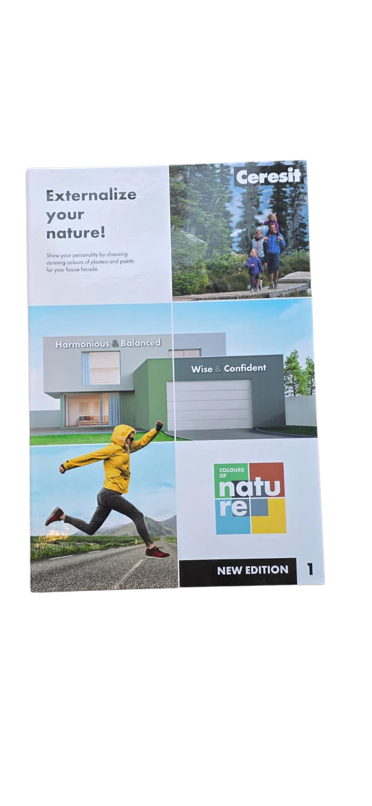
Book 1 is the first edition of Ceresit's Colours of Nature pattern book. Its cover carries the line Ceresit uses for the whole palette, "Show your personality by choosing stunning colours of plasters and paints for your house facade", and names the two palette groups this edition is built around.
| Feature | What Book 1 carries |
|---|---|
| Edition | Ceresit Colours of Nature, New Edition 1 |
| Palette groups on the cover | Harmonious & Balanced, Wise & Confident |
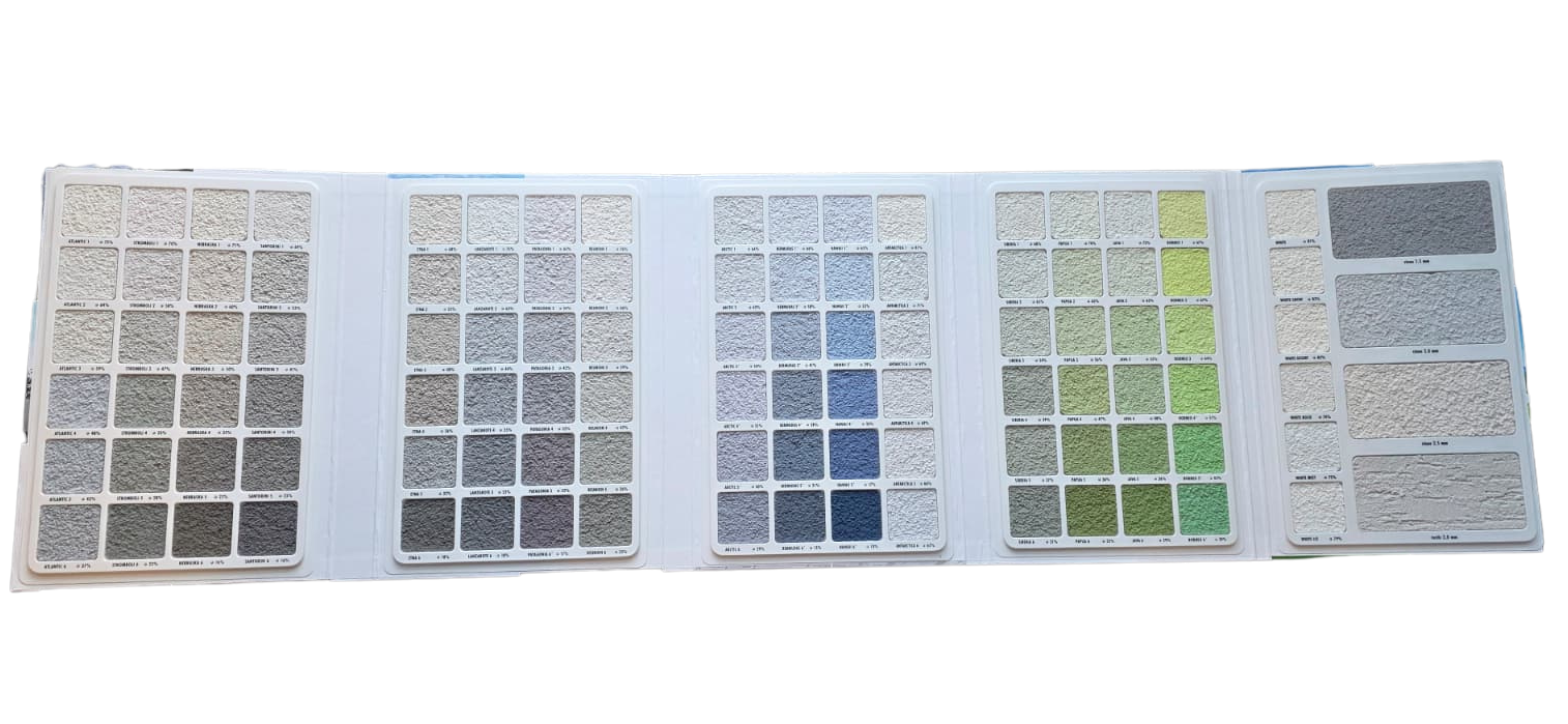
| Format | Fold-out panels of swatches, four across and six down |
| Swatch surface | Real render on a 1.5 mm stone texture |
| Labels | Name and number under each swatch, plus a percentage |
| Colours valid for | All Ceresit renders and paints |
Colour families such as Nebraska, Stromboli, Etna, Atlantic, Santorini and Lanzarote belong to Wise & Confident, and the whites, White and White Snow among them, to Harmonious & Balanced. Most Ceresit colours carry a name with a number and a two-letter code with the same number, so NEBRASKA3 is also NB3, and either form identifies the shade on an order.
The swatches are applied on Ceresit's 1.5 mm stone texture, and Ceresit's own note to the pattern book says the finished colour can differ slightly from the sample with the surface, the conditions and the texture of the render chosen. The grain ordered for the wall is part of that texture, and render grain size and how it shifts the finish covers that choice.
Book 1 or Book 2: Choosing the Edition
The Colours of Nature palette is split into named groups, and each book's cover names two of them. Order the Ceresit colour chart whose groups match the shortlist, or both editions where the client has not narrowed the direction yet.
| Edition | Palette groups named on the cover |
|---|---|
| Ceresit Colour Sample Book 1 | Harmonious & Balanced, Wise & Confident |
| Ceresit Colour Sample Book 2 | Romantic & Delicate, Energetic & Positive |
Ceresit's palette browser lists further groups beyond these four: Grey Vibes, Intense & Expressive, Visage and Mosaic, and none of them is named on the cover of Book 1. Two carry a product condition. Grey Vibes is designed for the special transparent bases of the CT 74 and CT 76 renders, and Intense & Expressive suits only CT 76 and one other Ceresit render. A shade from either group therefore fixes the render as well as the colour.
Why a Physical Sample Settles What a Screen Cannot
Ceresit says plainly that colours shown digitally may not represent the real ones and cannot be treated as a reliable presentation, and it recommends checking the authentic colour samples. The Ceresit colour chart answers that at the wall itself.
- Take the book outside at the property and hold the candidate swatches flat against the wall, then step back to the distance the elevation is normally seen from.
- Look again at another time of day, since a north wall and a south wall light the same shade quite differently.
- Set the last two candidates against the fixed materials, such as brick returns, roof tiles and window frames, because those are what the render has to live beside.
- Photograph the chosen swatch with its label in view and write the name and code on the order.
Checking Reflectance Before a Colour Is Approved
Ceresit publishes two reflectance figures for its colours. HBW, also called LRV, is the share of visible light the surface reflects; TSR is the share of total solar energy it reflects, across the ultraviolet, visible and infrared ranges. The higher both are, the less heat the facade takes in. Ceresit states that the HBW of each colour is given in its pattern books and pattern fans, and its palette browser shows both on a colour's own detail page, as for NEBRASKA3 below.
| Ceresit colour guidance | Figure |
|---|---|
| Recommended HBW for a finish coat | 20 or above |
| Recommended TSR for a finish coat | 20 or above |
| NEBRASKA3 (NB3), HBW and TSR | 50 % and 44 % |
Ceresit's general guidance is to use finish coats with an HBW and a TSR of 20 or above, and to consult its technical department where either falls below 20 so that a suitable solution can be found for the insulation system. The CT 76 data sheet sets its own line for that render at an HBW of 15 or above. Lead on the stricter figure of 20 when the Ceresit colour chart points to a deep shade, agree the build-up before the colour, and how dark render behaves under strong sun explains why.
From an Approved Colour to the Render on Our Shelf
An approved code from the Ceresit colour chart is ordered in a Ceresit render, and Renders World tints it to order. Each of the three Ceresit thin-coat renders we stock is offered in the Colours of Nature palette on its own data sheet.
| Render we tint to the approved code | Colour range on its data sheet |
|---|---|
| Ceresit CT 74 Silicone Render | Full Colours of Nature palette |
| Ceresit CT 76 Solar Protect Render | Colours of Nature and the Intense palette |
| Ceresit CT 174 Silicate-Silicone Render 1.5 mm | Full Colours of Nature palette |
Ceresit recommends its CT 16 quartz primer in the colour of the render beneath the finish, and it asks for products with one production batch number on each surface, printed on every container, because natural components can shift the final appearance. The rest of each render's specification sits in our thin coat silicone render range. A plinth in mosaic is chosen from its own samples, since a flat swatch cannot show a coloured aggregate, and the plinth render range carries those finishes.
We tint in the shop as orders arrive, so a tinted order runs on the same schedule as a stock order. The approval still comes first: tinted products stand outside our change-of-mind returns, and the Ceresit colour chart is the moment to be sure of the shade.
Ordering the Colour Chart
Renders World sends Ceresit Colour Sample Book 1 as a small parcel, and the order terms are short.
- Dispatch: orders are processed the same day when the book is in stock, and small parcels travel by next-day courier.
- Delivery cost: our team contacts you after the order with the cost, because the online store does not calculate it at checkout; every delivery is kerbside.
- Collection: in person from our Southampton counter at Unit 9A, Central Trading Estate, SO14 5JP, Monday to Friday 7am to 5pm and Saturday 7am to 12pm.
A book bought from us can be returned within 14 days in its original condition.
Once a swatch is approved, running a colour chart through a live project follows the code from sign-off to the scaffold, and a guide to selecting a render colour covers pairing it with roof, brick and joinery. For the palettes UK facades are moving towards, earth-tone facade schemes for 2026 gives the direction.
Questions Before Ordering the Colour Book
Which colour groups does Book 1 cover?
Its cover names Harmonious & Balanced and Wise & Confident. Book 2 carries Romantic & Delicate and Energetic & Positive, so a scheme drawn from both directions needs both books.
Can I choose from the colours on my screen instead?
Ceresit advises against it: digitally shown colours may not represent the real ones, and it recommends the authentic samples. The finished wall can still differ slightly with its surface, conditions and texture, which is why the swatch is judged outdoors.
How dark can the colour be on an insulated wall?
Ceresit recommends an HBW and a TSR of 20 or above for a finish coat and asks for its technical department to be consulted below that. Look up the code in Ceresit's palette browser for both figures, and confirm the render sheet's own condition before approving the shade.
Which renders can the colours be ordered in?
The colours in the Ceresit colour chart apply across Ceresit's renders and paints. On our shelf that means CT 74, CT 76 and CT 174 in the table above, with the Grey Vibes and Intense groups tied to particular renders.
Can tinted render be returned if the colour disappoints?
No. Tinted products stand outside our 14-day change-of-mind returns, which is why the approval belongs on the swatch rather than on the wall. The book itself can be returned within 14 days in its original condition.
Technical Documentation for the Ceresit Colour Book
- Ceresit Colours of Nature — the manufacturer's page for the palette, with its colour tools and downloads.
- Ceresit pattern book insert — the 1.5 mm stone texture of the samples, the renders and paints the colours apply to, one batch per surface, the HBW recommendation and the CT 16 primer.